•
Boostiko Team

Web3 Prop Firm Email Accessibility: Make Every Message Easier to Read
A polished email can still be difficult to use. Its instructions might disappear when images are blocked, its disclosure might fade into the background, or its button might say little about the page ahead. These problems matter when a reader needs to understand an account message rather than admire its design.
Web3 prop firm email accessibility starts with a practical question: can someone understand the message and take the intended next step under different reading conditions? That includes a narrow phone screen, enlarged text and assistive technology. The work belongs in the content brief, template and sending checks, not just the final visual review.
1. Explain what changed and who needs to act
Before choosing a layout, write the essential instruction in ordinary language. Explain what the message concerns, who it applies to, when anything happens and what the reader should do next. Include the time zone when a real date or deadline matters. If no action is needed, say so.
Web3 terminology can obscure a simple instruction. Define an unfamiliar acronym on first use and describe the actual task rather than relying on a label such as “complete the protocol.” Clear language and specific instructions are central to accessible writing. 2
Separate an educational update from an account notice or promotion. A guide announcement should not imply that a wallet approval or account action is pending. Avoid urgency unless there is a genuine, verified deadline. In email marketing for Web3 prop firms, clarity should carry the message instead of pressure or unexplained technical language.
2. Keep essential content in live HTML
Write the subject of the message, instructions, relevant conditions and primary action as live HTML text. A hero image can support that content, but it should not be the only place a reader can find it. Litmus recommends live text and structured content as part of accessible email design. 4
Use meaningful semantic headings, not paragraphs made larger to resemble headings. Give each heading a clear purpose and arrange the underlying source in the same order someone should read it. A simple one column layout is often a useful starting point for phone screens, although it is not a universal accessibility requirement.
Keep related information together: explanation, necessary qualification, then action. Avoid a visual layout that appears orderly but reads as disconnected fragments through assistive technology. If the template uses tables purely for layout, any presentation role belongs only on those layout tables, not on genuine data tables. Never hide essential copy or actions from assistive technology.
3. Give each image the right alternative
Alternative text depends on an image’s purpose in this particular message. An informative image needs the essential meaning it contributes, not an inventory of every visible object. A purely decorative image should have an empty alternative text attribute so it can be skipped. A functional image that acts as a link needs an alternative describing its action or destination. 1
Consider a screenshot showing where to find a guide. Explain that location in nearby live text so the screenshot is supporting evidence, not the only instruction. If a chart carries important information, provide a complete text equivalent rather than squeezing all its detail into a short alternative.
Review what remains with images disabled. The reader should still understand the purpose and destination. Avoid repeating a whole paragraph in image alternatives when the same information is already available as text. Context determines whether an image adds meaning or merely decoration.
4. Make body text and disclosures readable
Choose a comfortable body type size, a legible fallback font and enough line spacing for paragraphs to remain distinct. Left aligned text is usually easier to follow than tightly justified blocks. Test enlarged text rather than assuming a fixed font size solves readability. There is no universal legal rule that email body text must be 16 pixels.
For contrast, WCAG’s minimum contrast criterion provides a useful design reference: 4.5:1 for normal text and 3:1 for qualifying large text, meaning at least 18 point regular or 14 point bold. These values are not proof that an email meets all WCAG requirements or legal obligations. 3
Measure the actual text and background combinations, including footers and disclosures. Do not make conditions deliberately faint. Thin lettering can remain hard to read even at a threshold. Explain status in words, such as “Action required,” rather than relying only on red or green styling. Check light and dark rendering separately.
5. Make actions descriptive and easy to reach
A useful link label tells the reader what happens next. “Read the evaluation guide” is clearer than “Explore the future.” Descriptive labels also help someone navigating a list of links without the surrounding paragraphs. Identify a download’s format when relevant, but only call it a PDF if that is what the destination actually provides. 2
Keep the action set focused. Give the message one clear primary next step where appropriate, with a recognisable support route if the reader needs help. Ensure the destination matches the label and leads to the intended official page. An account action should not become an ambiguous request to “verify” something through an unfamiliar destination.
Check button spacing on a phone and verify that enlarged labels wrap without being clipped. Leave enough separation between adjacent links to reduce accidental taps. Keep necessary preference or unsubscribe routes visible where applicable. A large coloured button is not sufficient if its purpose is unclear.
6. Preserve meaning in the plain text version
The plain text part should be a usable version of the message, not a leftover collection of URLs. Keep the same material information: purpose, audience, timing, conditions and next step. Put each destination near a descriptive label so readers can understand why they might follow it.
Compare the HTML and plain text versions during review. If a qualification appears only in an image or a styled box, move it into the text that both versions carry. Do the same when copy changes late in production. The fallback must not describe an older action or omit a condition added to the designed version.
The versions need not look identical. They need to communicate the same material message. Readers should not have to enable images or switch to a richer display to discover information necessary for an informed next step.
7. Apply the approach to a guide update
Consider an illustrative email announcing an updated evaluation guide. This example describes content design, not a real account notice or a change to any firm’s rules.
Use the heading “Updated evaluation guide.” Explain that the guide covers account setup and where to find the applicable rules. Tell the intended readers why the document may be useful, then use “Read the evaluation guide” as the primary action. Do not invent a deadline, imply a pending wallet approval or suggest that trading conditions have changed.
Place that explanation and action in live text. A decorative illustration can have an empty alternative; a useful screenshot should be accompanied by the instruction it illustrates. The plain text version should carry the same explanation and destination. If the announcement links to a guide, check that the guide is readable too. An accessible email cannot compensate for an unusable next page.
8. Test the actual sent message
Send the template to authorised test inboxes rather than judging only a design preview. Check representative clients used by the audience, with images disabled, missing custom fonts, narrow screens, light and dark modes, and enlarged text. Email rendering and assistive technology support vary, so a successful check in one environment does not establish universal accessibility. 4
Navigate by keyboard and check that focus reaches actions in a sensible order. Listen with a screen reader: does the message make sense without its visual arrangement? Review heading order, link names, image alternatives and the plain text part. Confirm that buttons lead where their labels promise.
Use synthetic test data, including long names and missing optional fields. Look for literal template variables, clipped copy and empty gaps. Record the template version, client and assistive technology tested, observed problems and repair owner. Automated checks can support this work, but they cannot certify every reader’s experience.
9. Give reusable templates an owner
Start with one recurring message type and fix its shared components before expanding. Define acceptance checks for headings, essential text, alternatives, contrast, links and fallback content. Assign owners for copy, design and technical implementation, with the appropriate reviewer for material terms. Keep a version record so a later campaign does not quietly restore an old problem.
Build these checks into Web3 prop firm email operations and connect them to email automation testing. Test the destination journey too, including any login step. The email is one part of the task, not its whole experience.
Use reported reading difficulties and confusing actions to guide improvements. Do not assume every unsubscribe reflects an accessibility issue. When possible, include feedback from people using assistive technology. A checklist creates repeatability; actual use reveals friction the checklist may miss.
Where Boostiko fits
Boostiko can bring content, design and email operations together around a clearer reading experience. That means shaping understandable messages, keeping essential information outside images and making accessibility checks part of reusable briefs and review routines.
Technical implementation should be coordinated with the specialists responsible for templates, sending systems and destination pages. No single design pass can guarantee compatibility across every email client. If your team wants a practical starting point, contact Boostiko to discuss one recurring email journey and the collaboration needed to improve it.
References
Continue reading



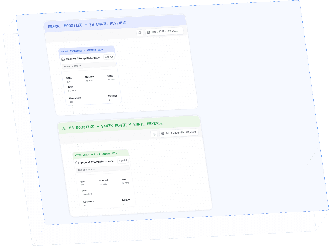
Case Study 01
Leading Prop Firm
$0 - $447K in 3 months
40.7% of total revenue
14 days time to first revenue
$0 to $447,115/month in Added Revenue in 90 Days